First thing you need to remember that every photo or digital artwork must have 1 point that catches the viewer’s attention. It can be (and mostly is) face or the eyes, but it can also be any other spot, that is the leitmotif of the canvas. When having too many points that catch the visitor’s attention, your artwork loses it’s charm and simply may lack the zest it would otherwise have with less accents on the canvas. So first thing you need to remember that in art, mostly, less is more.
Second thing to bear in mind is the depth of field. When you concentrate your look on a certain point, the rest becomes a little blurred in your vision, especially if the rest of the objects lay far behind. This is what we call — depth of field. In other words, human face cannot be just as sharp on the picture, as the background house that appears to be a few miles behind the figure. Although this isn’t always true and we have different variations of art (and sometimes the unusual is the best looking surreal concept!) but I am giving this little info so you will understand WHY we blur certain points and why we play with light the way we do, in this Photoshop Tutorial.

Ingredients:
http://dracoart-stock.deviantart.com/art/Asbury-Park-NJ-5-118481560
http://liam-stock.deviantart.com/art/Faballa-4-111550452
http://flordelys-stock.deviantart.com/art/sky-017-62717553
http://dracoart-stock.deviantart.com/art/Balloon-Festival-30-102183167
Get started.
We were working on a rather big canvas, we started with 1024px × 764px new layer as these were the dimensions of our base image. However you may feel more comfortable working with smaller or bigger images.
Take the image with fence and sand and paste it unto your Canvas:
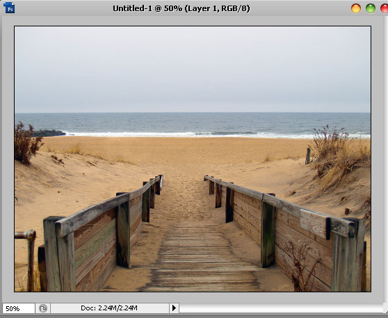
Using the Rectangular Marquee Tool, crop out and delete the sky and water upper half of the layer:

Don’t worry about the rough unnatural layer, we will work this out a bit later.
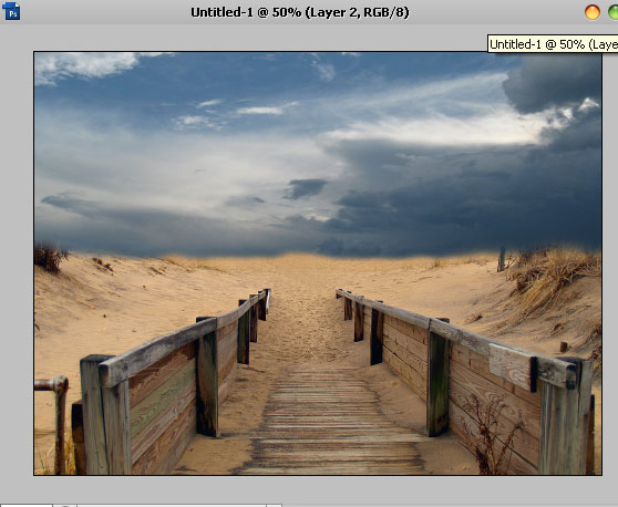
The next step is take the image with sky (from our ingredients list), and paste it on top of the previous layer with sand. Using Eraser Tool with a small soft brush, remove the lower part so that you will have an image consisting from sky and sand, just as you see below:
The way our image looks now, it’s very far yet from been an organically blended scene, so let’s start blending the layers into one another.
To make the sand less cheery, the easiest way is to simply match colors with the clouds, so this is exactly what we are going to do. While the sand layer is selected, go to Image >> Adjustments >> Match Color and apply the following settings:

if you have already unselected, select the layer with sand again, and go to Curves. Using the RGB channel, darken the image by dragging the curve down somewhere in the middle. We used Output: 113 and Input:143.

This will give our image a nice tone. The next step is — select the sky layer and go to Curves again, create a small point at the bottom and drag the RGB channel’s curve down, to make the sky dramatically darker.

Yet we got a much better toned canvas but still it is very well visible that the image consists from 2 different pieces, even if these pieces match way better in color than before.
We will be using a very old trick to merge the horizon lines of both layers. Simply create a new layer and using a big, soft brush (we are working with Brush Tool, in case I didn’t make myself clear), chose a black color and paste over the horizon line including the sand area outside the fence.

After you have brushes over that area, set this layer to”Soft Light” and you will have a much darker illusion as the view gets farther…
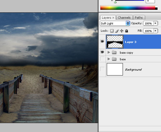
Next, we want to create an extremely mild HDR effect for the wood, so what we will do is create a new layer above the rest of the files, but below the dark layer we brushed with black color. Please pay attention because the sequence is important. We will not be working with masked layers at all throughout this tutorial.
Once that layer is created, click on the little “black and white” icon at the end of your layers palettes, the one that allows you to create a new fill or layer adjustment. Select “Exposure” settings. You will have a new layer with exposure settings created:

Using the “white” droplet, drag the Gamma Correction up to 0.82. See how the wood looks now, as if it’s been exposed to moon light! isn’t it beautiful?
To accompany that bright path we have in the middle, create a new layer and using your Brush Tool, white color and very big soft brush (say, 300 pixels), create a spot in the middle.

This spot should be placed above all the other layers and with blending mode set to Overlay:

Next, take out your stock photo with flying balloons, and crop them out. Don’t worry if cropping isn’t perfect, because once you placed them on your canvas, we will resize them to much small size and any imperfections will be blurred naturally.
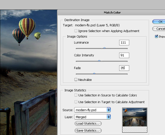
Once they are on the canvas, you will notice that they look terribly misplaced, and they need something that will blen them in nicely. The easiest solution (and please bear in mind that our tutorial is targetted at beginners) is to add clouds, that will “cover” the balloons, easily blending them into the composition.
So, create a new layer and go to Filter >> Render >> Clouds. With your background color set to Black and your foreground set to White (this is important!) — create clouds..
